A work in progress, but a stunning work in progress
Like Windows 3.1, Whistler is a point release upgrade to a major operating system release that's going
to change everything. We could debate Microsoft's version numbering scheme for eternity,
but the simple truth of the matter is that Whistler--Windows version 5.1, likely to be
named Windows.NET ("Windows Dot Net") 1.0 when it's released in late 2001--is going to
be a must-have upgrade for all Windows users. Note that I didn't qualify that in any
way: If you use Windows--Windows 95, 98, NT 4, 2000, whatever--you will want to upgrade
to Whistler.
Sounds bold, doesn't it? But it's true: One thing that's gotten lost in all the talk about
the next generation Internet and Microsoft's "Dot NET" plans is that this company makes a
killer operating system. And when Microsoft is on a jihad--as it is now--the company does
its best work. As the ultimate client for Microsoft's future Internet, Whistler will be the
front-end, the "user experience" if you will, for all of the plumbing and services work that Microsoft
will create over the next few years. And because Microsoft wants you to use Whistler--and not
an iMac, Linux box, or Web terminal--to access the Internet, play games, and get your work
done, the company, finally, is acting like it gives a damn. So Whistler will come together in
less than two years, compared to the nearly four-year-long development of its predecessor,
Windows 2000. Perhaps most importantly, Whistler will finally deliver on the promise Microsoft made
to combine its consumer and business OSes into a single codebase. They all said that it wouldn't
happen. But here it is.
Genesis
Whistler has undergone a strange evolution. During the Windows 2000 beta, Microsoft
began work on subsequent versions of the OS, a practice it began with Windows 95,
when its successor, Memphis (Windows 98), began development at virtually the same
time. Originally, Microsoft had two projects in the works, "Odyssey" and "Neptune," which
focused on the business and consumer-oriented follow-ups to Windows 2000 respectively.
But in late 1999--as exclusively reported in WinInfo--the company decided to meld the
two projects into one, which it renamed Whistler.
Neptune, especially, was a mess. Originally designed to employ an HTML-like user
interface, Neptune would have replaced the Explorer shell with a "Start Page" and
other Activity Centers designed to provide users with simple front-ends to common
tasks. Odyssey, meanwhile, was focusing on the changes to Windows 2000 that customers requested
most often. Internal turmoil aside, things changed dramatically and Whistler was born.
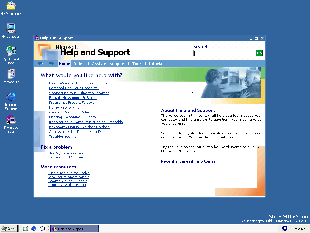
The Activity Centers design was largely tossed aside (though you can see vestiges of
the idea in Windows Media Player 7, Help & Support (Figure), and other Whistler/Windows Me
features) and a new XML-based user interface was devised. Called Visual Styles, this
new user interface shows up in rough form in the first official Whistler Preview (build 2250),
which was shown at the Professional Developers Conference (PDC) 2000 in mid-July 2000.
But Visual Styles isn't the only change brought by Whistler. In this look at the Whistler
Preview, I'll demonstrate those things that have changed between Windows 2000 and Whistler.
A first look at the Whistler Preview
The Whistler Preview is available in Personal and Professional editions, though the final version will, of course, include Server editions as well (Microsoft later supplied Advanced Server build 2239 to testers and I take a quick look at that version here as well). Whistler Personal Edition is designed as an upgrade for Windows 9x/Me users, while Professional is obviously targeted at the business-oriented users of Windows 2000 Professional. At this stage in the game, the differences between Personal and Professional are not that obvious: Professional includes a Remote Desktop option (based on Terminal Services) that will help system administrators remotely administer Whistler desktops, for example. But the big difference--and one that's sure to cause some anger among computer enthusiasts--is that Personal Edition only supports one processor. This "feature" wasn't enabled in the preview (that is, it's possible to get dual processor support working in Whistler Personal 2250), but Microsoft assures me that the final version will support a single processor only.
Going forward, there will probably be more differences, such as different default user interfaces or whatever, and it will be interesting to see how these two versions of Whistler diverge. For now, however, the user experience on both editions is functionally identical, employing a Windows 2000-like Explorer look and feel by default. Whistler runs much, much more slowly than Windows 2000 on comparable hardware, and consumes many more megabytes of RAM, but I expect this to improve over time as this build is just a pre-beta version. Comparing this release to Windows NT 5.0 (nee Windows 2000) Beta 2 might be a fair comparison: It's very close to its predecessor, but it's got enough new features to make you sit up and take notice.
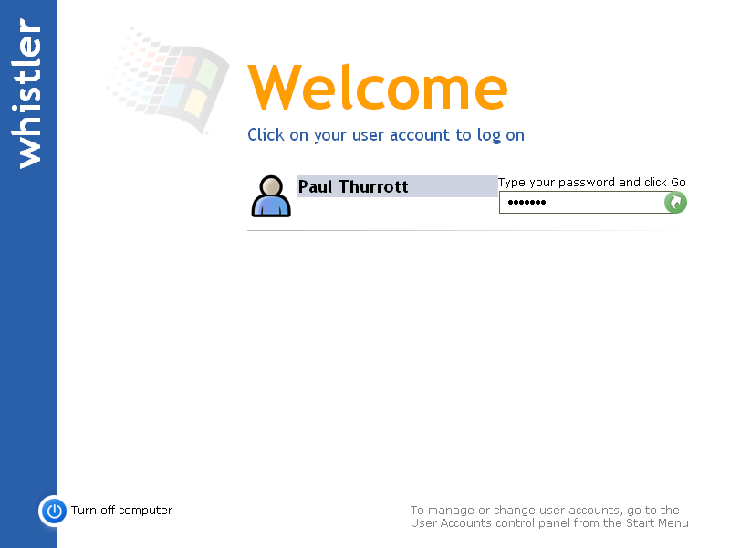
And the new features are very interesting. Right off the bat, Whistler confronts you with a logon screen straight out of Neptune, the original post-Windows 2000 project for consumers. Continuing the Neptune theme, Whistler provides you with a friendly, graphical logon screen (Figure) that allows you to choose images for each person that needs to logon to the system. Whistler ships with five Weeble-like images, but you can already add your own if desired and it's expected that future releases will include more sample images for easier customization.
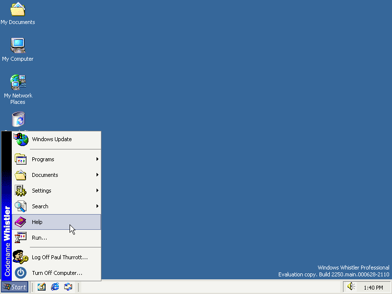
Once the Whistler desktop loads (Figure)--which takes an eternity compared to Windows 2000--things don't seem so different. The familiar desktop, Start button, and taskbar are all present, and things work as you might expect. However, a few right-clicks reveal a bounty of improvements, including (finally!) a right-click option on the Start button that lets you display--God forbid--Start menu properties. In every previous version of Windows, you had to click on the taskbar to get Start menu properties (and no, I don't know why). Start menu properties are just part of the larger Start and Taskbar Properties dialog, which has been extensively overhauled with numerous new features. The most obvious new feature is called "Clean up the notification area," sort of a "personalized menu"-like change that allows you to hide icons in the system tray (to the left of the clock) unless you need them. This feature kicks in without any warning, but you can also modify its behavior with this option: Microsoft employs a small blue chevroned icon that covers up the tray icons. When you click the icon, its slides left, revealing the tray icons once again. And when you move the mouse out of the tray, it slides back. No doubt this feature was added to improve the available real estate at the bottom of the screen, and it seems to work well. The blue icon has occasional graphical glitches that I'm willing to chalk up to it being a pre-beta.
Right-clicking the desktop and choosing Properties reveals some interesting tidbits, most of which are bad news. First of all, the dreaded Active Desktop isn't just the default option in Whistler, it's the only option. I'm not sure whether this will change in future builds, but right now, we're stuck with Active Desktop and all of the overhead it adds to the system. And the Display Properties dialog has changed dramatically, mostly to support the new user interface skinning feature, called Visual Styles. But the changes to this dialog make many options require more mouse clicks than they did in Windows 2000, and